Valeria Sablina
theme:

All cases Case 01 — Qonversion

No-Code Builder at Product startup

The No-Code Builder is the tool mobile teams use to assemble and publish their subscription screens without a developer — a product inside the product. I inherited its first version and rebuilt it. The same body of work produced two more things the product runs on — its design system and its onboarding — and both are chapters of this case.

26+ user flows shipped in the year that followed the redesign
  • ~3 weeks — the full redesign of the editor, light and dark at the same time
  • The redesign unblocked development — the team could ship features again
  • AI image generation inside the builder, with its own prompt history, designed as part of it
  • One product, three chapters — the editor redesign, the design system under it and the onboarding
Product
No-Code Builder — paywall builder inside Qonversion (B2B SaaS, subscription infrastructure for mobile apps)
Role
Product designer — lead interface designer on the product
Team
Head of Product, dev lead, CEO, frontend engineers
Timeline
Redesign delivered in ~3 weeks, then a year of feature flows
Deliverables
Editor redesign in light and dark, the builder's own UI kit, template gallery, multi-page editing, payments, AI image generation
Result
26+ flows shipped within a year

Chapter 01

The editor redesign

The builder I inherited, and what three weeks of redesign changed.

The first version was dark, visually raw and clearly built under time pressure. Underneath, though, it carried a genuinely worked-out system of component states — action types, navigation, purchase and restore behaviour, all specified. The surface was not worth keeping. The logic was.

So the redesign was not a repaint. I rebuilt the editor end to end and drew the light and the dark theme at the same time, so every component was born with both appearances and engineers never had to guess at the second one. It took about three weeks.

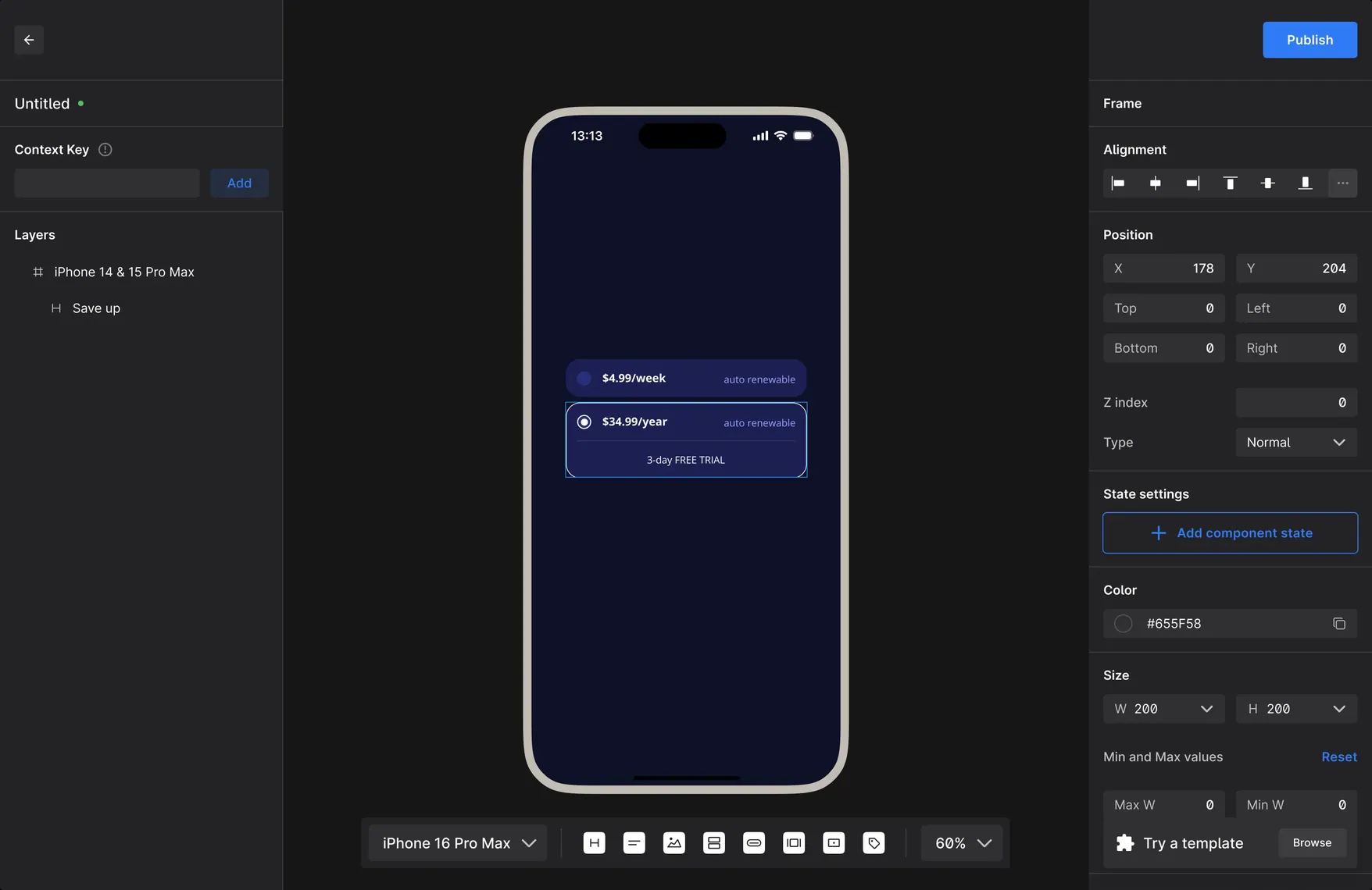
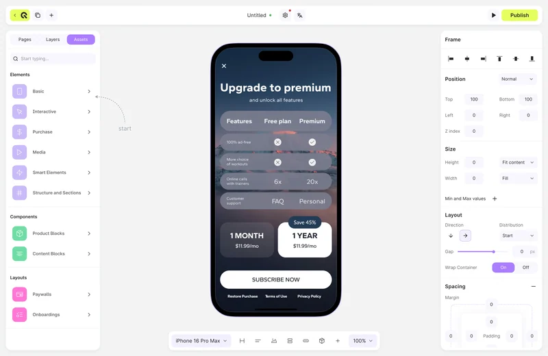
The redesigned editor in the light theme: cleaner toolbar, structured layers panel and grouped settings.
Editor of the first builder version: dark interface with a layer list, phone canvas and a settings panel.
2024 — inherited 2025 — redesign
Drag the handle to the left — or focus it and use the arrow keys — to uncover the redesign underneath the version I inherited. Same editing model, rebuilt as a product surface.
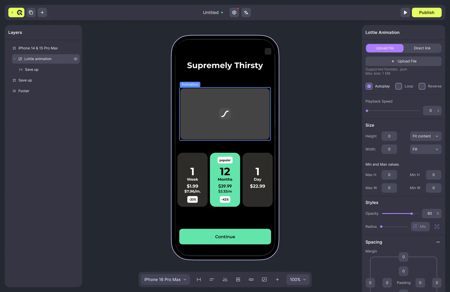
The redesigned builder in the dark theme: layers panel, phone canvas with a paywall and the frame settings panel with position, size, layout and spacing controls.
The same editor in the dark theme. The right-hand panel is where most of the design work sits: position, size, layout and spacing, all of it mapped to what the renderer can actually do.
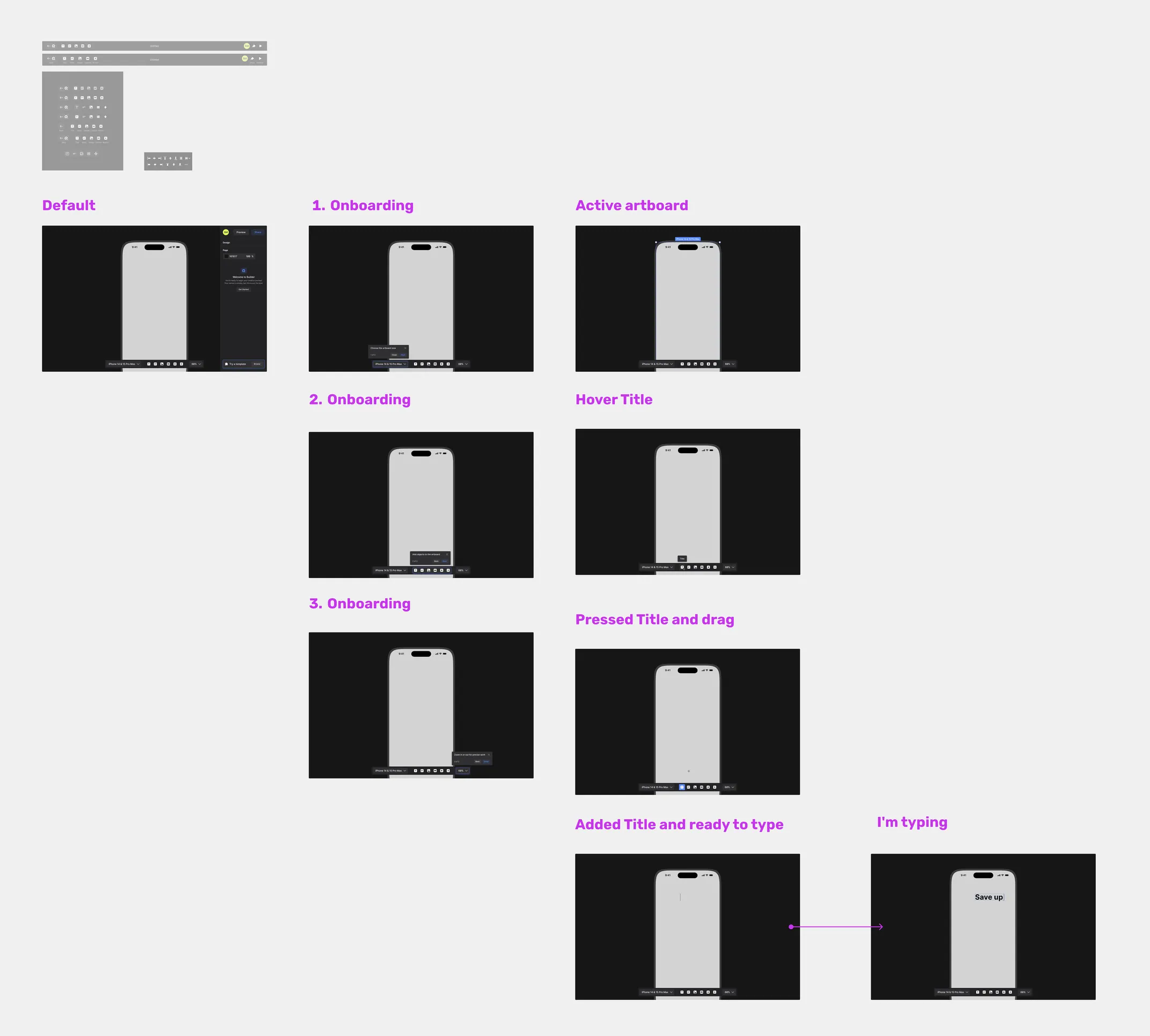
Two toolbar states of the builder: the default edit state and the hover state, with the publish button highlighted.
States are drawn, not described. The toolbar in its edit and hover states, straight from the file.
The builder's own UI kit: buttons, inputs, panels and controls, light theme above and dark below.
The builder’s own UI kit — both themes on one sheet. scroll →
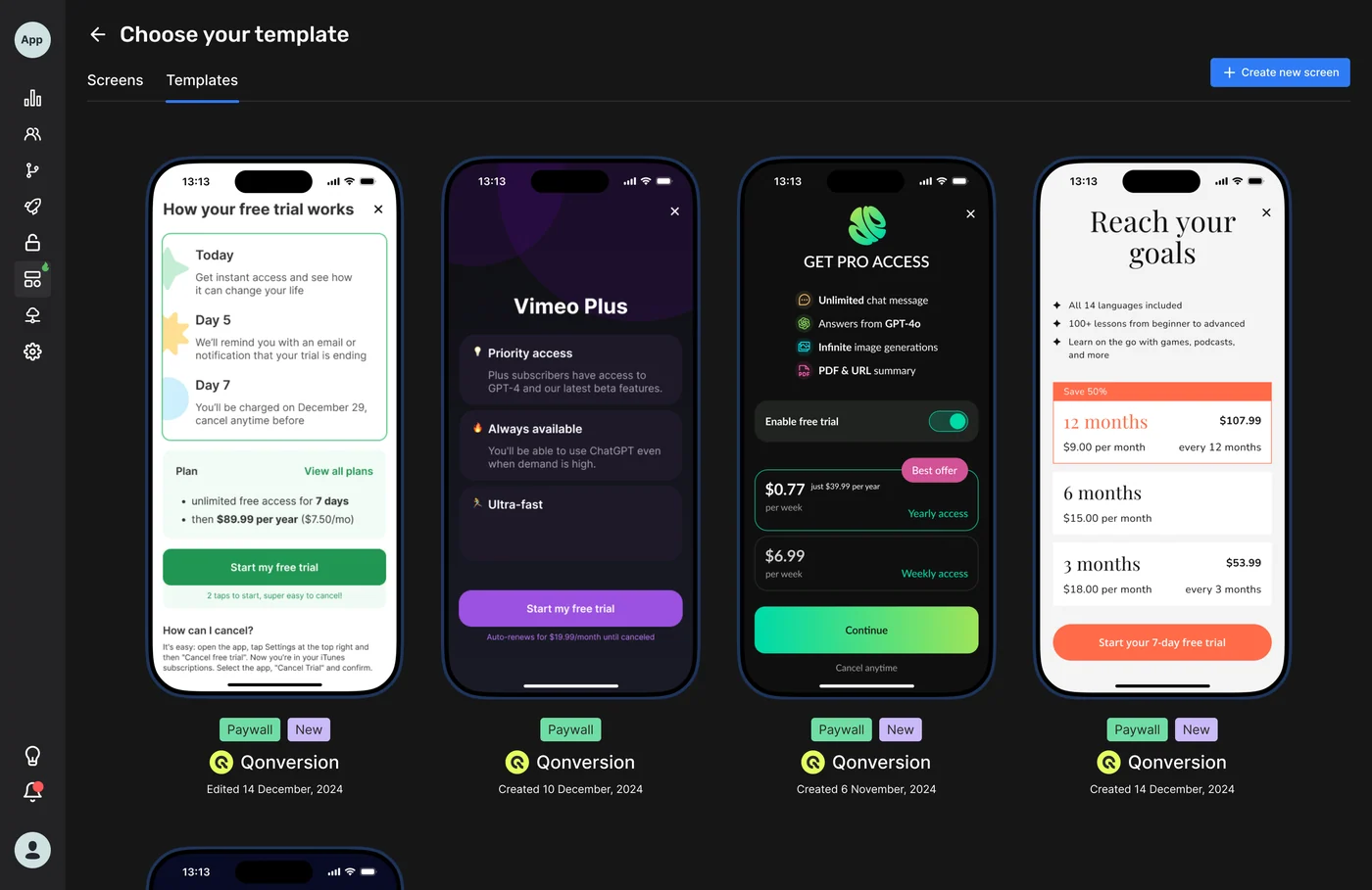
2024 — template gallery Template gallery of the first builder version: dark modal with paywall template previews.
2025 — template gallery The redesigned template gallery modal in the light theme with categorised paywall templates.
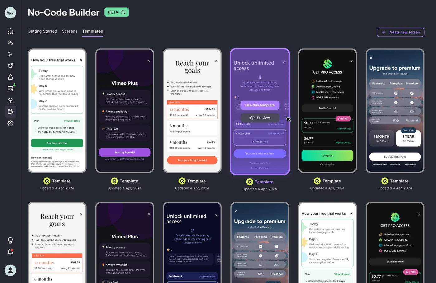
The template gallery is where most users start a paywall, so it got the same before-and-after treatment as the editor.
The redesigned template gallery modal in the dark theme.
The same modal in the dark theme — one component, two appearances, no separate file.
Specification of the default paywall: layout rules on the left, the rendered canvas on the right.
Specification of the default paywall — layout rules next to the rendered result, which is the form a handoff takes when the engineer has to reproduce it exactly.

AI inside the product: image generation

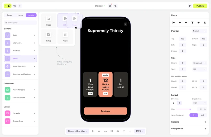
The image generation task came to me from the Head of Product, and I designed it: users generate artwork for a paywall from a prompt, and the builder keeps a history of those prompts so a result can be found again and iterated on. Designing a generative feature is mostly designing for uncertainty — waiting, failure, versions, and the moment a user wants the previous attempt back.

Specification sheet of component settings: container and button actions including URL, deep link, purchase, navigation, screen closing and restore purchases.
The state and action specification I inherited and kept working from — every action a component can perform, written down before it is drawn.

Who I worked with

  • Head of Product — design reviews, marketing analytics behind the decisions
  • Dev lead and frontend engineers — brainstorming how features would be built, weighing the better option
  • CEO — brought in feature ideas

The file keeps the traces of that work: copy-checked sections, ready-for-dev pages, and dated update logs across the year.

Chapter 02

The design system underneath

The library the builder and the rest of the product are built from: semantic tokens, components in two themes, 275 icons.

275 icon components maintained in the library
  • 2 themes — every component drawn light and dark at the same time
  • Storybook — the library implemented by the engineering team
  • Dated changelog pages — the system was maintained, not shipped once
Product
Qonversion — B2B SaaS, subscription infrastructure for mobile apps
Role
Product designer — owned the design system end to end
Team
Head of Product, dev lead, CEO, frontend engineers
Deliverables
Semantic colour tokens, component library in light and dark, typography kit, 275 icons, modal and navigation patterns
Handoff
Implemented by engineers in Storybook
Longevity
The team later migrated to shadcn/ui and the system carried the transition

A system starts at the colour layer, and the colour layer is not a palette. Every value in this library is a semantic token — Background, Surface, Content, Border, Action — and every token carries both a light and a dark value, so a component never has to know which theme it is standing in.

Action tokens go one step further and carry their states: initial, hover, pressed, disabled. That is the difference between a colour sheet and a system an engineer can implement without asking a follow-up question for every interaction.

Action tokens: primary and secondary in initial, hover, pressed and disabled states, each with its light-theme and dark-theme value and hex codes.
Action tokens with their states. The violet and the lime you are looking at on this page are these exact values — the site is painted in the system it describes.
Full sheet of semantic colour tokens grouped by Background, Surface, Content, Border, Action and product-specific groups.
The full token sheet, grouped by role rather than by hue. Taller than it is wide, so it scrolls inside its frame — click to open it full size.

Components are built on top of that layer, and each one ships with every variant and every state it will ever need in production. A button is not one rectangle: it is size, hierarchy, icon slots, loading, disabled — twice over, because light and dark were drawn together rather than ported afterwards.

buttons — light Button component in the light theme with all sizes, hierarchies and states.
buttons — dark The same button component in the dark theme, state for state.
One component, every variant and state, in both themes.
Drop-down menus in every state: default, hover, selected, error and a searchable variant.
Drop-downs, shown at full size — every state a menu can be in, including the ones nobody remembers to ask for.
controls Checkboxes, radio buttons, switches and their default, hover, focused and disabled states.
table Table pattern with header, row states, selection and pagination.
Controls and the table pattern.
tags & badges Tag and badge components in their colour variants.
navigation Side navigation pattern with active, hover and collapsed states.
Tags, badges and the navigation pattern.
Wide sheet of the common component library: light theme on the top row, dark theme below.
The Common Components sheet — the whole library on one canvas, light above, dark below. scroll →
Typography kit: the type scale as named styles with their size, weight and line height.
The typography kit is a set of named styles, not a pile of font sizes — which is what makes it implementable.
icons — light Part of the 275-icon set shown in the light theme.
icons — dark The same icons in the dark theme.
275 icons, maintained as components rather than as files.
Overview of modal window patterns: confirmations, forms and content modals.
Modal patterns — one behaviour, several content shapes.
palette guide Colour palette guide with the ramps and their usage rules.
brand colours Additional brand colours with their applications.
The palette guide behind the tokens.

A system that stayed alive

The file carries dated changelog pages — component and colour updates logged as they happened. That is the part that separates a design system from a UI kit: someone has to keep answering questions about it months later. When the engineering team later moved to shadcn/ui, the system had the token and component vocabulary to make that a migration rather than a restart.

Who I worked with

  • Head of Product — design reviews, marketing analytics behind the decisions
  • Dev lead and frontend engineers — putting the library into Storybook, brainstorming how it would be built, weighing the better option
  • CEO — brought in feature ideas

The library was not designed in isolation and handed over: real dashboard pages were pulled back into the file to check the system against what shipped.

Chapter 03

Onboarding for the builder

The task was plain: build the onboarding for the product. What made it arguable was taking four competitors apart first.

4 competing products taken apart by one method — sign in, sign up, dashboard — before a screen was drawn
  • Sign-up and setup rebuilt — OAuth as a first-class way in, setup asking one thing at a time
  • Every state drawn — errors, empty states, loading, verification waiting
  • Handed over ready for development, in the same library as the rest of the product
Product
Qonversion sign-up and setup — B2B SaaS onboarding
Role
Product designer
Team
Head of Product, frontend engineers
Deliverables
Competitor research across 4 products, new sign-up and setup flows with full state coverage
Method
Competitor teardown first, design second

The task was to build the onboarding for the No-Code Builder: the path from a first sign-up to a product that is actually set up and connected. Two moments in that path do the damage — email verification, which quietly stops people before they ever start, and the setup itself, which asks for everything at once.

That set the design principles. Make OAuth a first-class way in, so the verification letter stops being a gate. Apply progressive disclosure, so setup asks for one thing at a time instead of presenting a wall of fields. And treat connecting an app and installing the SDK as the real goal of onboarding rather than a step someone might get to later.

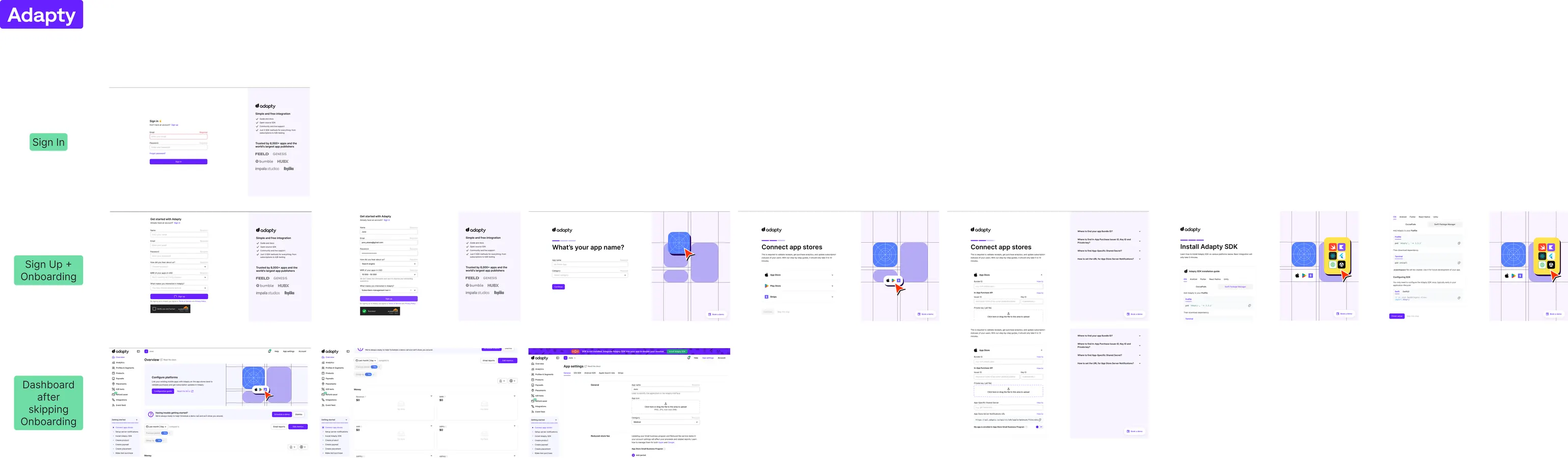
In parallel I took apart four competing products — Adapty, RevenueCat, AppHud and Purchasely — using one consistent method for each: sign in, sign up, dashboard. Comparing the same three moments across four products makes the differences arguable instead of decorative.

Competitor research canvas: Adapty sign-in, sign-up and dashboard screens annotated side by side.
Competitor research — Adapty. scroll →
Competitor research canvas: RevenueCat sign-in, sign-up and dashboard screens annotated side by side.
Competitor research — RevenueCat. scroll →
Competitor research canvas: AppHud sign-in, sign-up and dashboard screens annotated side by side.
Competitor research — AppHud. scroll →
Competitor research canvas: Purchasely sign-in, sign-up and dashboard screens annotated side by side.
Competitor research — Purchasely. scroll →

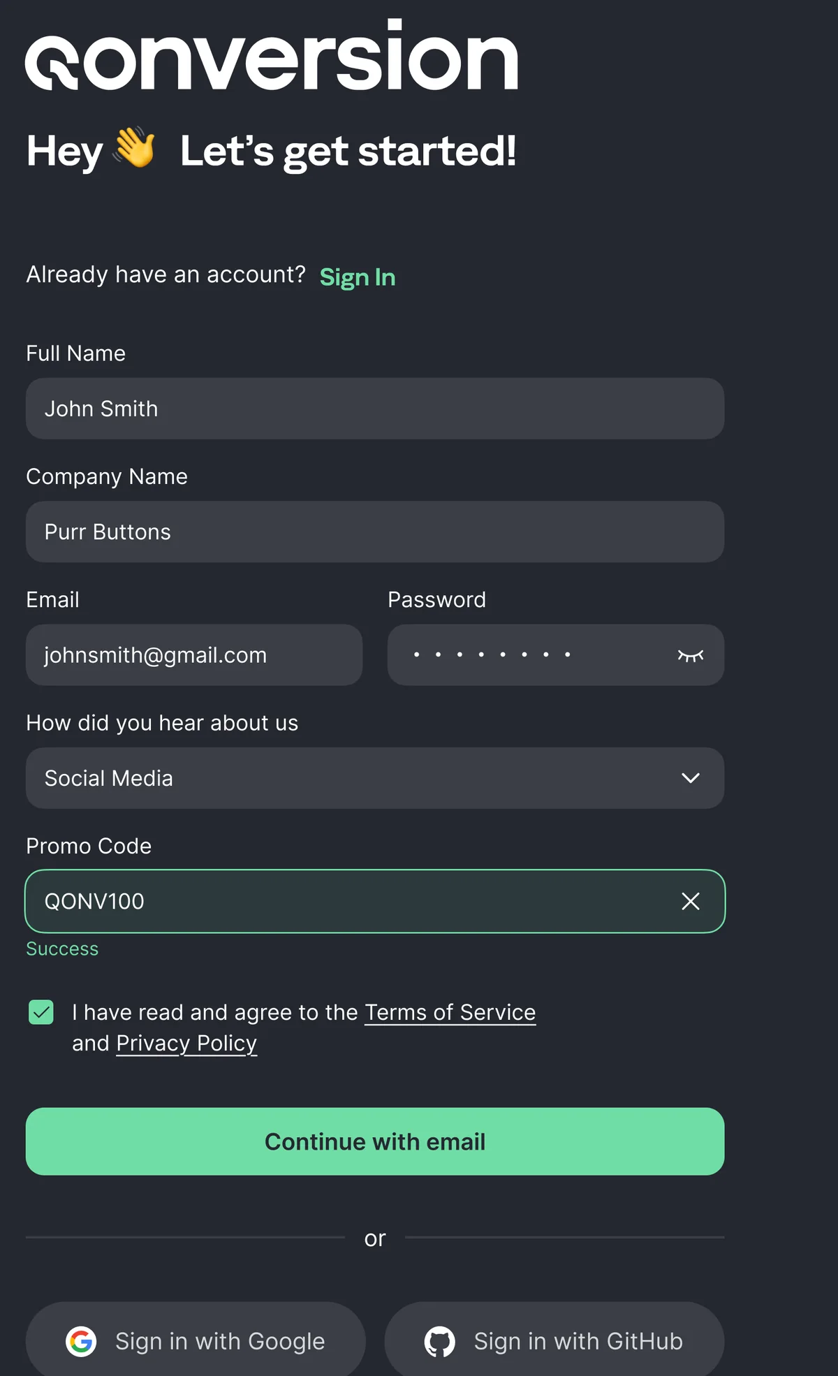
The new sign-up puts OAuth next to the email form instead of behind it, keeps the form to the fields that are actually needed, and carries its error and validation states as designed screens rather than as a note for engineering.

The new sign-up screen in the light theme: email form with OAuth options next to it.
The new sign-up. OAuth sits next to the email form rather than behind it — and yes, the screen exists in both themes, like everything else in this product.
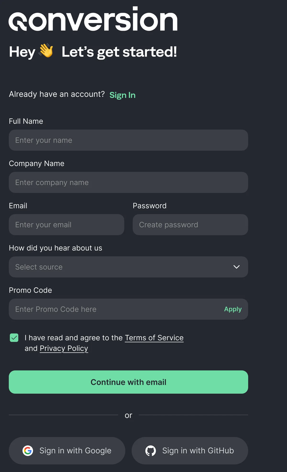
sign-up — empty The sign-up screen in the dark theme with every field empty.
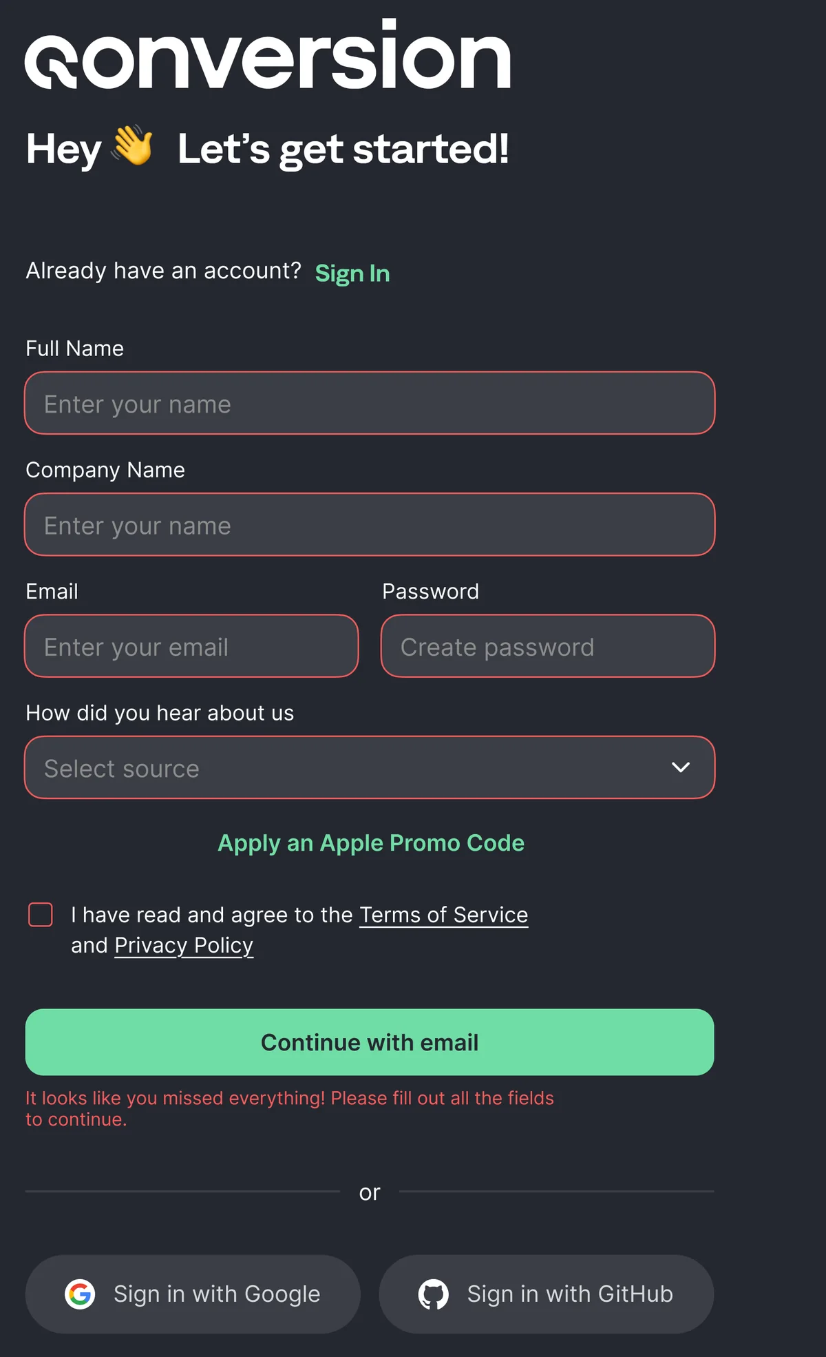
sign-up — errors The same screen with validation errors on the fields and on the terms checkbox.
sign-up — filled The same screen filled in, with the promo code accepted and the primary action enabled.
One screen, three states — empty, failing validation, complete. This is the level of coverage a handoff needs if engineering is not going to invent the rest.
Check-your-email screen after sign-up, with a resend action.
The email step the data indicted: forty per cent of people never came back from here, which is why OAuth was promoted rather than politely added.
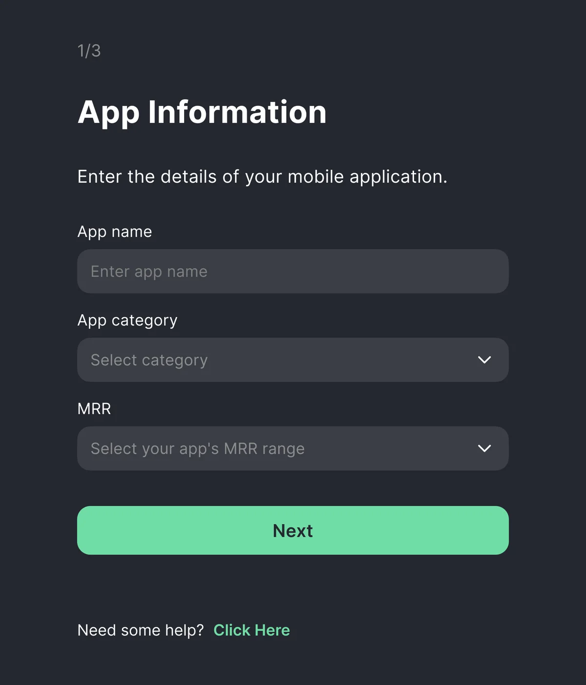
setup 1/3 — app information Setup step asking for app name, category and monthly recurring revenue range.
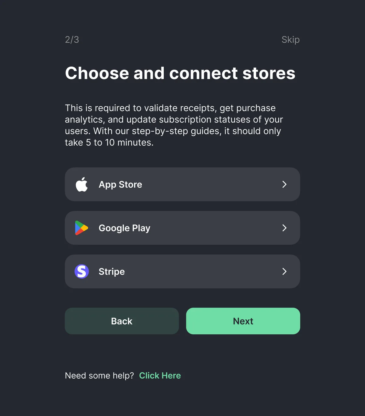
setup 2/3 — connect stores Setup step for connecting App Store, Google Play and Stripe accounts.
Setup, one question at a time, with the step counter visible — progressive disclosure in practice.
Setup step for installing the SDK with platform tabs for iOS, Android, Cordova, React Native, Flutter, Unity and Capacitor, and code snippets for each.
The SDK step — the point of the whole onboarding: the product only starts working once an app is connected.
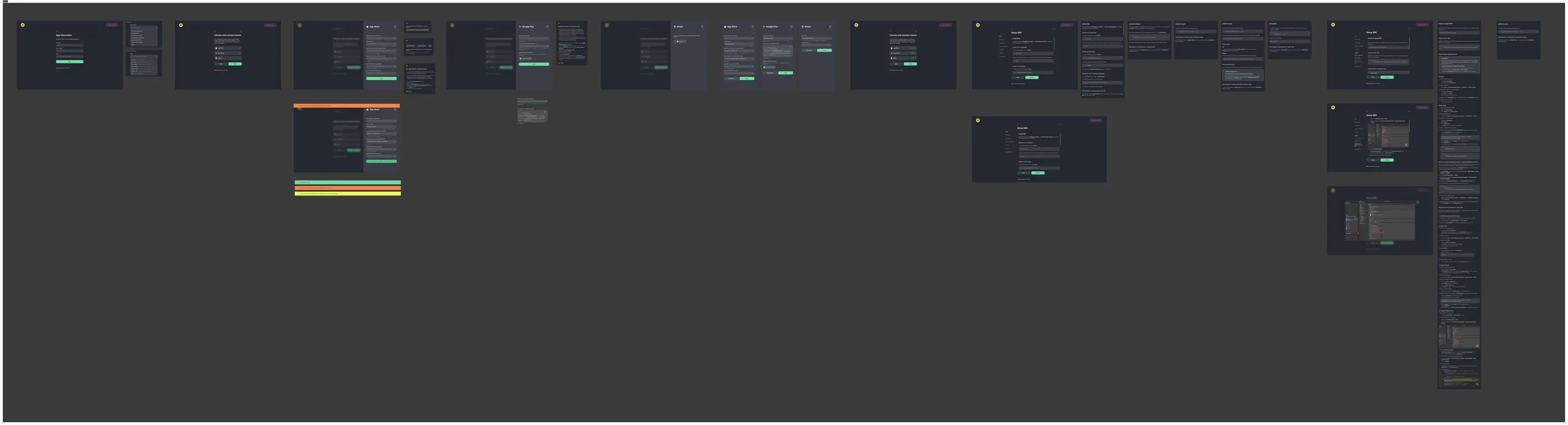
Overview canvas of the whole onboarding flow, screen by screen with the connections between steps.
The whole flow on one canvas, as it was handed over. scroll →

Who I worked with

  • Head of Product — design reviews, marketing analytics behind the decisions
  • Frontend engineers — brainstorming the build: what the sign-up could actually do, and the states they needed from me

The analysis was written for the product team in the first place: the case exists because the argument was made in the company before it was made in a portfolio.

Get in touch

Open to product design roles — remote across Europe and Eurasia, or hybrid in Serbia. The quickest way to reach me is email or Telegram.

@Lsablina_R LinkedIn All cases